


The cautionary tale of my Personal Project
- Lily Hoagland

- Feb 1, 2022
- 4 min read

The Personal Project: known for marking the end of the International Baccalaureate Middle Years Programme, fulfilling an A-G service requirement, and, most notably, inducing anxiety.
Like many other students, I put off starting my project until winter break, officially beginning on December 28th. I’m still not completely sure I’ve done it correctly. Anyway, I thought I’d share my experience so that, hopefully, someone can learn from it…and also because I made it part of my success criteria.
Coming up with the idea
I first came up with my concept around November 23rd, going off of the fact that I really enjoy watercolor painting (specifically portraits). I usually get overwhelmed by trying to draw or paint landscapes, so I thought it would be interesting to learn how.
Starting the project
Despite having come up with my idea about two months prior, when I finally started, I still had to do quite a bit of research to figure out where to begin. In particular, this ManageBac article helped me understand what was required of me.

In terms of my success criteria, I decided to complete one practice piece (using techniques based on my research on watercolor landscape painting), 4 pieces using photos of Eagle Rock as references (I ended up scaling down to only 3 due to time constraints), and 1 Plein-Air piece (a painting done with a live reference).
In most of my paintings, I tried to choose references that demonstrated the contrast between the architectural and the natural. I also strived to implement an impressionistic style as I painted.
My Paintings
Practice


Although this painting was one of my least favorites, I definitely learned a lot through trial and error. I originally thought it would take only one attempt, but I ended up painting four drafts to reach this point, which I think can be attributed to my complete inexperience (these bumps in the road are great to add to your process journal since they demonstrate your willingness to reflect on your work and make changes).
In hindsight, the smaller details look rushed and sloppy. If I had slowly built up the layers of paint, the lines would have been cleaner, which is something I tried to apply to future pieces.
Photo referenced #1


You might have already noticed that I tend to “crop” out large areas of my references. When things aren’t working out I often decide to cut off my least favorite areas, and this piece was no exception. I accidentally messed up the windows, foliage, and cars on the left side of the painting.

Even though I lost about half of the painting to my own dissatisfaction, I am content with my choice to simplify some of the more intricate details into shapes or blobs. However, I could have included more shadows, as the painting looks pretty flat.
Photo referenced #2


This piece is my favorite by far. I had to exercise a lot of patience as I painted the details of the greenery, which I did from left to right for optimal comfort (I’m right-handed).

Instead of cutting off my poor rendering of the shopping cart in the middle of the reference, I decided to paste a square of tin foil over it. In the words of Bob Ross, I think this was a happy accident because it made me think about how the shopping cart is out of place among the plants and sort of sullies the scene.
Photo referenced #3


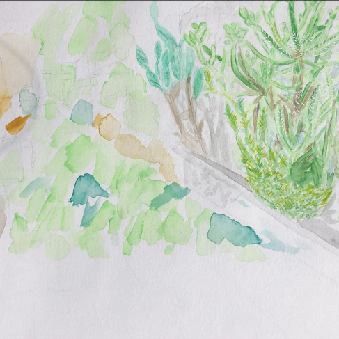
Following the high of my favorite piece, I reached a new low. I repainted this about three times and I never got past the cactus (I was so displeased with the first draft that I used it as scrap paper, hence the random paint blotches). I’m not sure if I’m just too much of a novice to tackle this reference or what, but I moved on because other deadlines were approaching.
Plein-Air


I saved the worst for last, my Plein-Air piece. While my mistakes are partially attributed to the fact that I began painting too late in the day (the lighting was constantly changing as the sun was setting), I was definitely at fault for how I portrayed the depth, especially the mass of leaves on the right of the tree.
If I had more time, I would have reattempted this piece because I think it would improve, and also because I liked painting in the open air.
Final Thoughts
In spite of my shaky start, I’m satisfied with what I learned about landscape painting. Through the ups and downs, reflecting on my progress with my process journal has allowed me to analyze and draw conclusions about my own work, a skill that will ideally help accomplish other goals.
As long as you’re willing to dissect “failure”, there is potential for success, which I think is the general sentiment of the Personal Project. If you haven’t started your project, or won’t for a couple of years, I’d recommend beginning sooner rather than later, that way you’ll have more time for experimentation.
Hopefully, I’ve done it correctly as it seems everything is complete…well except for the report (and my 3rd photo referenced piece).


Comments